ShopDreamUp AI ArtDreamUp

Deviation Actions


Suggested Deviants


Suggested Collections


You Might Like…


Featured in Groups


Description
Edit: Got a lighter version the other one was way to dark.
Really need to calibrate my screen...0.0
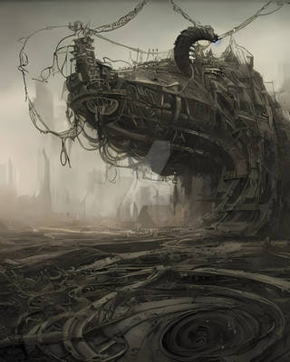
Here we have my very first environment, does it suck??
Hey all, sorry for the lack of updates lately, haven't really been completely satisfied with my works as of late. But I might as present you guys with some recent works, I'll try to update on a weekly basis from now on.
If anyone's interested, here's the Process
Also I have something to ask of everyone watching me along with those that have just stumbled on here, if it's not too much trouble, I would like your honest opinions on whether or not to include some new pieces, that are going to be shown today along with those in the near future, in my portfolio. I really want to get a strong portfolio going on and I figure some honest (brutal) feedback would be best as I want to get some bigger and better jobs out there as well as improve the shit out of my self.Lmao
Enjoy! Poop and Rockets
Blog | CGHUB | Deviantart | Facebook | Portfolio | Twitter
Really need to calibrate my screen...0.0
Here we have my very first environment, does it suck??
Hey all, sorry for the lack of updates lately, haven't really been completely satisfied with my works as of late. But I might as present you guys with some recent works, I'll try to update on a weekly basis from now on.
If anyone's interested, here's the Process
Also I have something to ask of everyone watching me along with those that have just stumbled on here, if it's not too much trouble, I would like your honest opinions on whether or not to include some new pieces, that are going to be shown today along with those in the near future, in my portfolio. I really want to get a strong portfolio going on and I figure some honest (brutal) feedback would be best as I want to get some bigger and better jobs out there as well as improve the shit out of my self.Lmao
Enjoy! Poop and Rockets
Blog | CGHUB | Deviantart | Facebook | Portfolio | Twitter
Image size
1000x448px 100.95 KB
© 2011 - 2024 ChunLo
Comments37
Join the community to add your comment. Already a deviant? Log In
well this is not really a critique but sort of maybe? <img src="e.deviantart.net/emoticons/let…" width="15" height="15" alt="
First off it's a decent composition but there's nothing interesting going on, I think the diagonal lines are the only things that keep the interest. From the pose of the character I assumed that you were going for a dynamic look and that rock in the middle really has it, but it's right in the MIDDLE of the composition and there's really not much going on on other parts except for a few highlights. You don't want to have the focus right in the middle of the composition, it'll make a boring one, no matter how much realism and detail and awesomeness you add to the rest.
What I suggest for this piece is that, shift the camera to either side, or/and slant it to either side, and it'd be really nice to see some yellow reflection on the water and some extension of the light coming from the right because light does pick up light too, and - oh you could even put some cyan in it too that'd play well with the yellow right above it.
And also I don't really know what's going on above the explosion, it'd be nice to see an established sky ( or whatever you have there, floating islands )
So yeah, keep at it, I've got the eye for it <img src="e.deviantart.net/emoticons/w/w…" width="15" height="15" alt="